Spotlight on Thesis: University of Arizona Capstone
Over the past few weeks, I have asked several people here at WHA about their final “thesis” projects from their time in college. I was curious to see if, looking back, there was anything that could be learned from these school projects. What I found, overall, was that many principles of design and planning that we use every day at our firm were explored much earlier by forward-thinking students in their final years of college. Many were theorizing the future cornerstones of urban planning, master planning, and architectural design, striving to push the industry further. Over the next few months, I plan to take a closer look at several of these projects. For now, I’ll start with the project I know best—my own.

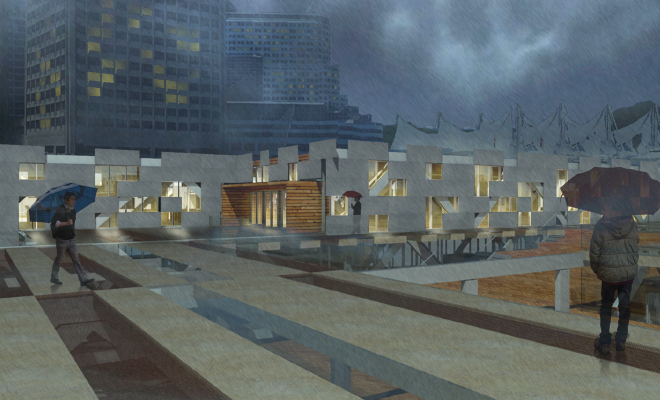
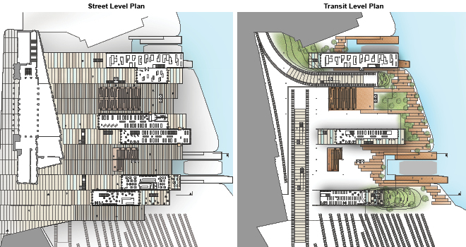
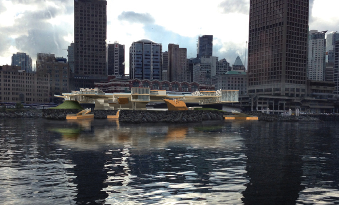
At the University of Arizona College of Architecture, we called our final project Capstone. The students in my studio were tasked with designing a ferry terminal in Vancouver, Canada. Many took that to heart, and spent the year crafting beautiful, boundary-pushing structures and spaces to support people in transit. I took a broader approach, creating a hub for multiple modes of transportation while focusing on the theory of placemaking within the mobile, often temporary environments of transit architecture.

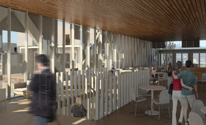
After months of work and plenty of feedback from my peers and professors, I developed a permanent steel structure that extended the city grid out to the waterfront. This armature would house various public programs—a farmers’ market, art gallery, coffee shop, and a large community plaza—while also remaining flexible for future additions or subtractions, as the city and the people using the spaces inevitably changed over time. These program elements would visually engage with the transportation options available, showcasing the systems people in transit were there to use: buses, subway, long-line trains, and ferries.

So, what can we take away from this? First, design is not always a one-person show. My project would have looked entirely different had I ignored the advice and critiques I received along the way and would have been worse off for it. Second, rigidity is the enemy of design. Be fluid and don’t try to push together a concept with a disparate building, or vice versa. Rather, the two should be harmonious. Lastly, just because many people choose to go left, doesn’t mean you can’t go right. Go the direction you feel is best for what you are trying to achieve.

School is often the time where people can be the most creative. No clients, no budgets, just the freedom to design to your heart’s content. Thus, I believe students are perhaps best-suited to push our profession forward, stretching the boundaries before they even know where those boundaries are. We can look back and learn a lot from our past projects, finding principles we used then to apply to the work we do today to continue advancing our fields into the future.


Kaila Gottlieb
epic