The Abigail: Branding Bridge Housing’s First Affordable Community in Portland’s Renowned Pearl District

Oftentimes we look at a logo and think “What’s the story behind that one” or “How interesting, I wonder what it means” or sometimes, “How in the world did they come up with that?” Whatever it may be, a logo is something that people recognize. It’s what you’re remembered for; it’s the face of your brand and your company. A logo should say something without saying everything. It should speak to the brand and its foundational pillars in an artistically crafted way that is pertinent to you. This is where Placewright Design, WHA’s Branding studio comes in.
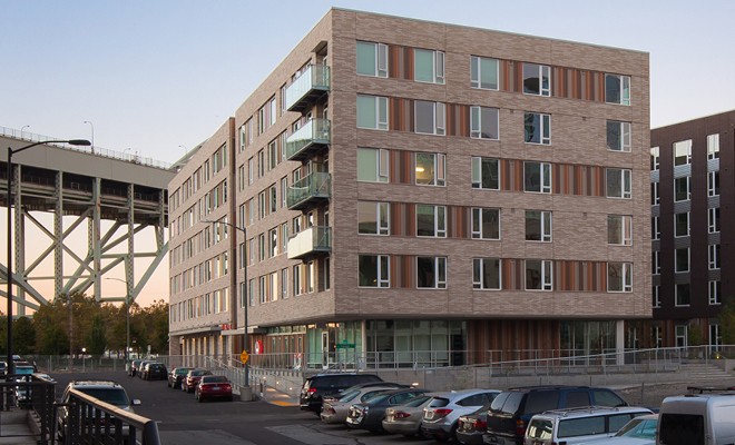
When first approached by Bridge Housing to develop the new identity, we were immediately intrigued. The Abigail, Bridge’s first project in Portland’s Pearl District near Fremont Bridge is named after Abigail Scott Dunaway, an early 1900s equal rights activist and Portland businesswoman whose passion and drive for equality sparked a new generation of thought. We started our process with the profound knowledge and excitement that The Abigail is a unique opportunity, providing affordable housing alongside market rate units, truly “bridging” the gap and bringing people together, similarly to its namesake. As such, conveying the concept of equality was instantly a significant objective. And so began the process of turning our initial concept into a cohesive brand narrative, starting with…the logo, of course.

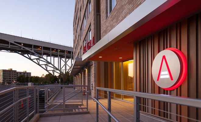
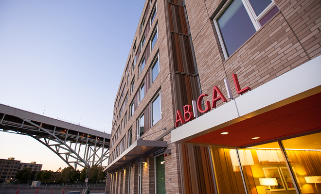
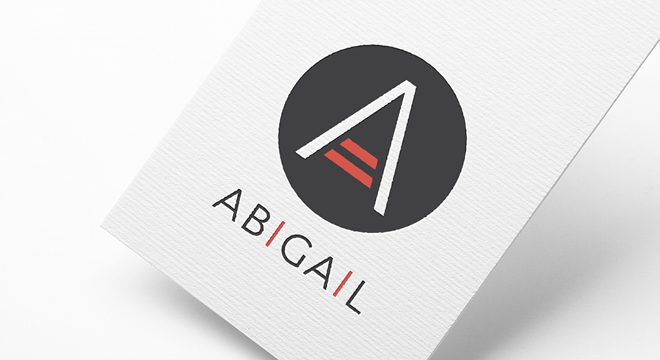
The icon’s emphasis on the two lines in the “A” conveys equality and fair opportunities. The circular backdrop suggests that fairness and equality is at the center in the development of the community. The color palette was carefully curated to pair with the interior and exterior of the building, as well as the clean, modern feel of the Pearl District. Extending the identity outdoors and integrated into the façade, the exterior sign showcases the icon in a three-dimensional panel, with the habanero red panel mounted directly to the building and the aluminum facing panel mounted on top, backlit to create a contrast and a strong wayfinding platform. This combination resulted in an elegant, sleek and energetic design against the routed aluminum finish and the juxtaposition of the habanero red. Carrying these artistic elements further, the two “I” letters in the wordmark are accented to tie back into the brand narrative. All in all, our goal was to create a bold, friendly and unique identity.

So, what goes into a logo? Collaboration, meaning, purpose, creativity, passion and … good design.
Similar to Dunaway’s passion, we wanted to create something that honored her persistence as well as Bridge Housing’s commitment to the community. We are proud to have played a part in the development of the Pearl District’s game-changing new community. The Abigail is officially open welcoming its residents.
“We’re thrilled by the opportunity to partner with others and develop The Abigail,” said BRIDGE Housing President and CEO Cynthia Parker, who has deep roots in the region. “We’re excited about working in the Pacific Northwest, where we believe BRIDGE’s core values are well-aligned. We are committed to building green and to being a great community partner with our mission of quantity, quality and affordability.”
For more information about The Abigail, click here or visit Bridgehousing.com.


Leave a Reply